What makes a great photography website? It should do one thing above all else: put your photos front and center. This makes a huge difference, whether you’re a wedding, landscape, or business photographer. The ideal photography website should reflect both you and your work.
Just like in your art studio, your Jimdo website offers unlimited possibilities when it comes to showcasing your photos. We’re going to show you some photography websites with the wow factor and explain how each example makes the biggest impact.
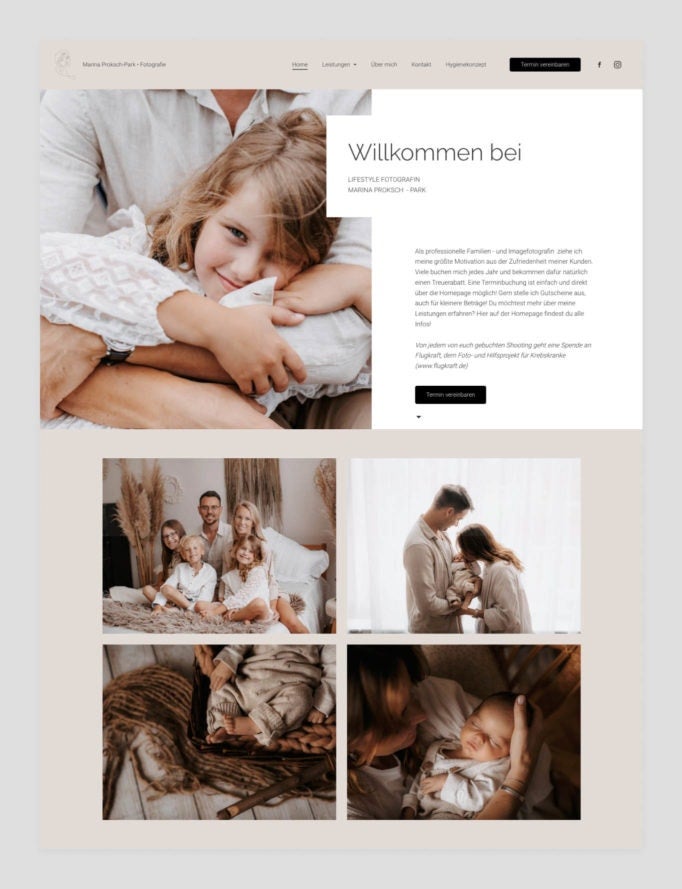
Marina Proksch-Park Photography: Harmonious color branding down to the last detail
As a family photographer, Marina’s passion is capturing the most beautiful milestones over the course of a lifetime—from couples’ photo shoots and pregnancy pics to new-born baby shoots and family portraits. Marina’s photography style is bright, warm and natural. which is reflected in her website’s harmonious color scheme. It’s appealing, professional, and enhances the impact of her portfolio. What’s really useful is that by using the integrated calendar tool, Marina’s customers can easily book a photo shoot with her.
A sharp focus on the portfolio: Photographer Alina’s ‘Hej, it’s her’ photography website
Photographer Alina began her photography project “Empower women with amazing pictures” in 2020. For this project, she takes photographs of women in a wide range of scenarios, from businesswomen in the workplace and super-moms in action, to athletes and artists in their element. Her aim is to take pictures of women just as they are: “Minimalist female portraits, without the fanfare.” Alina followed the same principle when creating her website hej-its-her.com —you can find all the essential information, without your attention being drawn away from the project itself. The clean and structured layout of the powerful female portraits in the gallery helps them make the biggest impact.

Rocco Parente lets his transparency do the talking.
Authentic, vibrant, honest—this is how photographer Rocco describes his wedding photography. The Swiss photographer has photographed ‘the happiest day’ in many couple’s lives for ten years now. It’s particularly important to him to capture the intense emotions which make this day so unique and personal. By including numerous reviews on his website roccoparente.com, Rocco demonstrates how wonderful the final result is and how happy his customers are. He also presents his bronze, silver, and gold plans under Services, so that his customers can see what suits them best.

Clearly structured and with no unanswered questions: Studio B‘s detailed FAQs
Studio B’s website is a little less romantic and a bit more serious. Well structured and simply designed, the website delivers a clear overview of the personal branding photo shoots on offer. The gallery shows just how varied these can be—three to four images are displayed for each project, which offers great insight into the diversity and variety of the people being photographed. But what are personal branding photo shoots? To answer this question, Studio B has incorporated an FAQ section into their website, where they can answer the most important questions about their services—smart thinking!

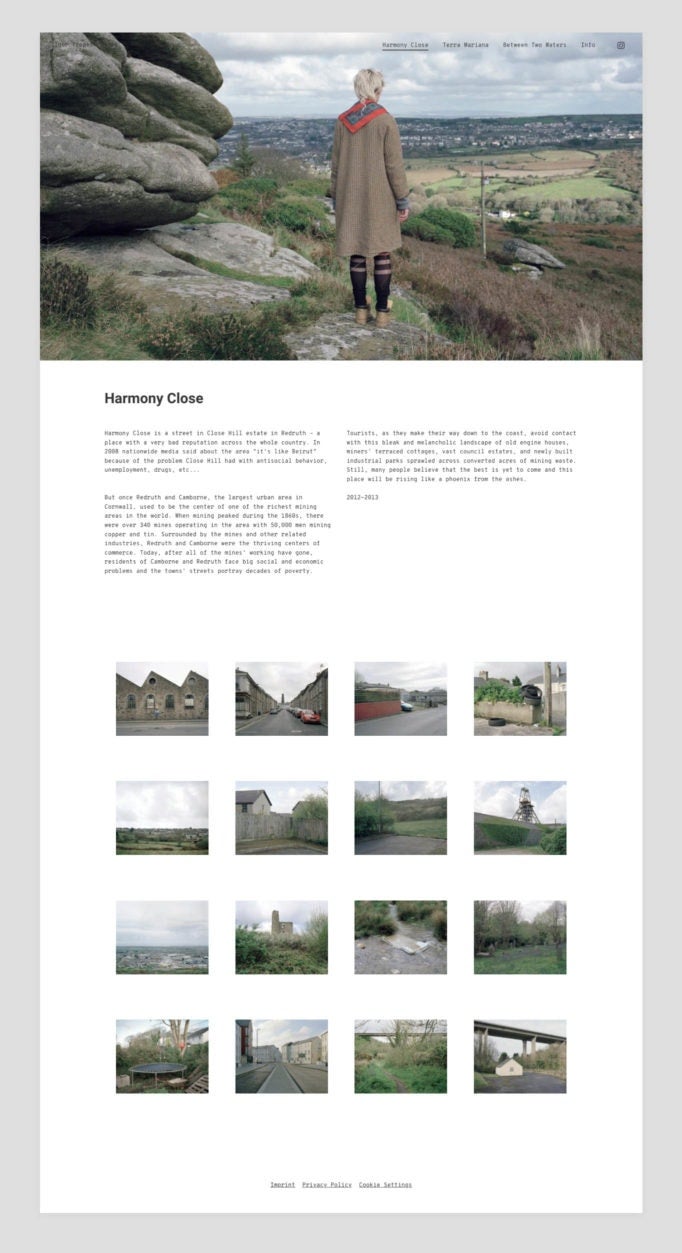
Effective minimalism on Igor Trepeshchenok’s photography website
A picture is worth a thousand… you know what I’m going to say. This oft quoted, but frequently true guiding principle inspired Igor when creating his website trepeshchenok.com. The minimalistic, striking images of the landscape do the work themselves, without unnecessary ornament. In addition, the understated style of the website underlines the story these fascinating photos have to tell. Igor wants to capture real, unadorned, and raw life in his pictures. The Latvian photographer’s uniform gallery lets you appreciate the imposing images as a whole and then display them fullscreen if you want. As simple as it is brilliant.
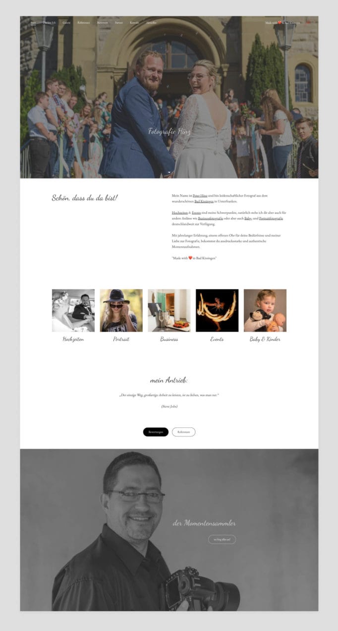
Personal recommendations: Peter Hinz suggests his trusted partners
Peter has been a passionate wedding and event photographer for many years. This is clear as soon as you open his website fotografie-hinz.de onto his powerful hero image. Over the course of his professional career, he’s produced a great deal of pictures, which you can see in his extensive gallery. The wide variety shows how different events and styles can be, and just how talented Peter is at capturing the mood every time. We love how Peter has a page dedicated to “recommendations”. Here he recommends trustworthy colleagues who offer flowers, music, and the like for the big day.
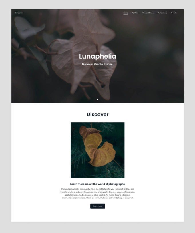
A Tips and Tricks section: Lunaphelia
“The girl who loves the moon.” This is a rough translation from Latin of the pseudonym which Lunaphelia goes by. Swiss photographer Linda understands “photography as a form of expression” and likes to play with the mysterious atmosphere of the moon. Her website Lunaphelia perfectly reflects this mysterious ambiance. We particularly like the “Tips and Tricks” section of her photography website, where she passes on her photography tips to visitors. The site is still under construction, but it’s already looking impressive.
Top photography website tips
- Let your pictures speak for themselves. Don’t use too many effects around your photos. In this case, less is more.
- Craft your portfolio around a concept; whether you place your photos in different categories or display pictures with a variety of different themes together on the same page—the most important thing is to put your plan into action in a uniform way.
- Create a harmonious color scheme. It doesn’t matter if they are bright colors or highly saturated images, they need to work together. The colors of your photos should combine with your website to create a well-balanced overall impression.
- Your homepage needs to impress. Choose a photo that has the wow factor to use as your header image or the background for your homepage.
- Social Media! Many photographers get jobs through referrals. That’s why you need to integrate social media buttons and stay in touch with previous customers who might recommend you to their friends.
- Make sure you take full advantage of buttons and display your contact details. It’s likely you want your photography website to showcase not just your pictures, but also to attract new customers. Add buttons to the bottom of your pages which lead customers to your contact page and use a booking block to help turn website visitors into customers!
- Be transparent. Include an FAQ section, your service plan, or similar items on your photography website, and make it easier for potential customers to get an idea in advance.

