Your pricing page is more than a list of figures. Almost every potential customer will visit it to compare your products so they can decide what to buy. They want to know if your site offers what they need and if they can afford it.
As a business owner, you already have all the information your customers need. You know your products and your prices. And you probably know what’s important to customers who buy from you, too.
Now you need to organize that information for your visitors. In this article, we’ll show you how to create a pricing page that’ll support your customers at every stage of the buying process.
How do customers buy a product?
How do people choose the right product? Most customers start by browsing. They look at different products from various companies until they have a good picture of what their options are. Once they do, they’ll look at a few in more detail. Those details help them decide what to buy and where from.
Do you like asking companies about their prices? What information do you expect from them? Many customers assume that they’ll be hit with a sales pitch when they ask about pricing. Or that the company will always push their most expensive option. By laying-out prices clearly, on your website, you’ll give customers all the information they need to make a confident decision.
What info do buyers need throughout the buying process?
- Browsing customers want an overview of all products. They want to know if you offer what they need and which options will work for them. You can help them along by providing a clear name and brief description of each product.
- Choosing customers want to compare product details. They want to know why one product is different from another and which matches their wants, so they can choose the best one. You can help them by including product details, customer reviews, and recommendations.
- Buying customers want to compare your offer with those from other companies. They look for a clear description of what they’ll get for their money, so they know they’re getting a good deal. You can help them by clearly stating what’s included in each offer and how much it costs.
How to design a pricing page for every customer
Customers may visit your pricing page several times, with different intentions each time. In this section, we’ll explain how to make your pricing page useful for customers at any stage of the process. You’ll want to look at the number of products you sell, what details are most important, and how customers make their final decision.
There are lots of pricing page templates you can use to design your page. Which one is the best for your business? It depends on what you offer. Here are some examples:
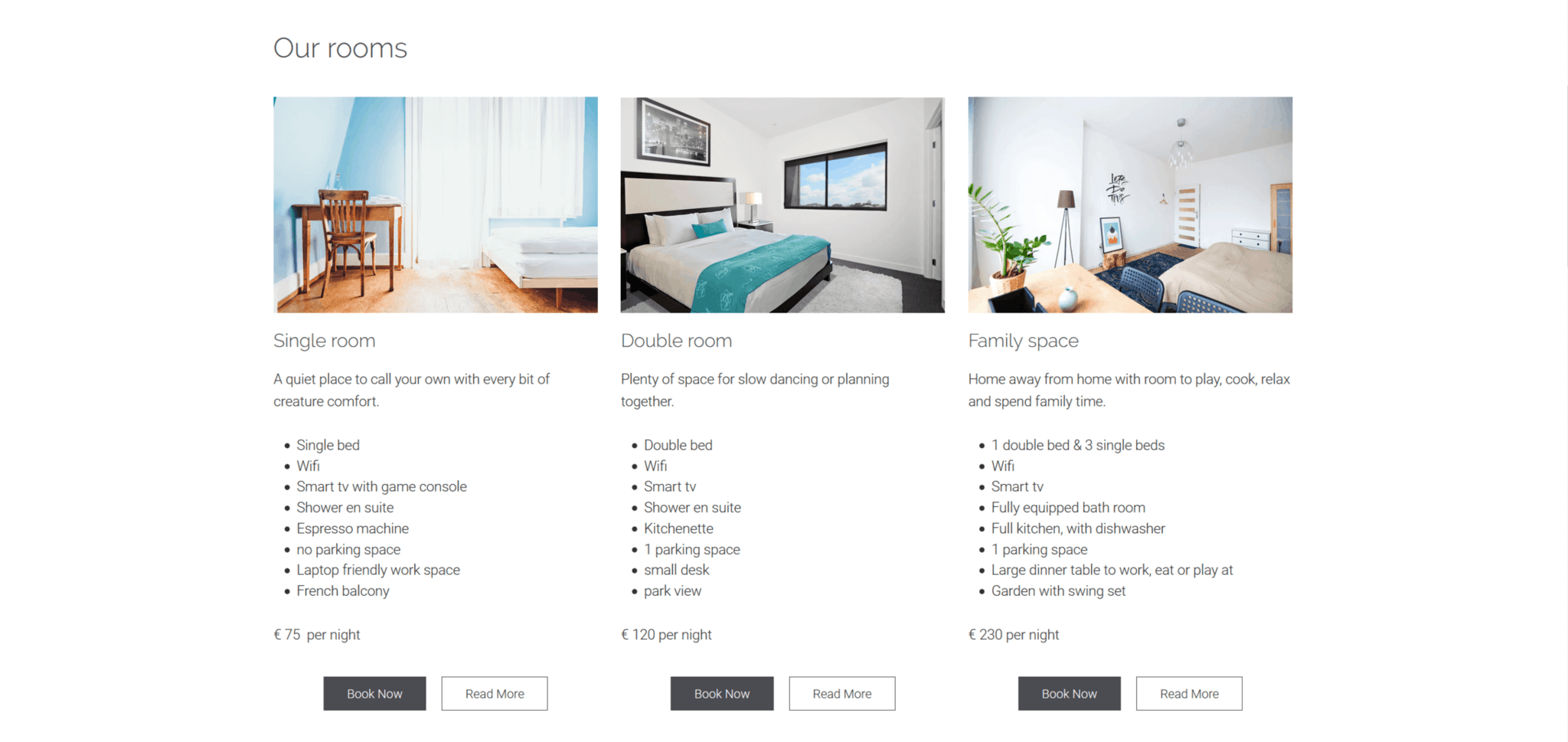
1. Pricing table
A pricing table makes it easy to compare different products. Customers can easily see what features come with each product. As they go through the pricing table, they’ll build their own pros and cons list for each option. Now they’re almost ready to buy.
Columns are the clearest way to arrange this information. Give each feature it’s own row, so customers can compare products easily.
Remember: if customers visit your site on a small screen, like a mobile or tablet, your columns will be displayed one below the other instead of side by side. To make sure your pricing table looks good on mobile, keep all information about one product in one column.

When to use it:
- When you have only a few products.
- When each product has several important details.
Overview for browsing customers:
- Use product names as headings.
- Include a short description customers can read without scrolling.
Details for choosing customers:
- Summarize important details.
- Include links to product pages.
Offers for buying customers:
- Show prices with a clear currency sign and mention any additional costs.
- For every feature, indicate if it’s included in a product.
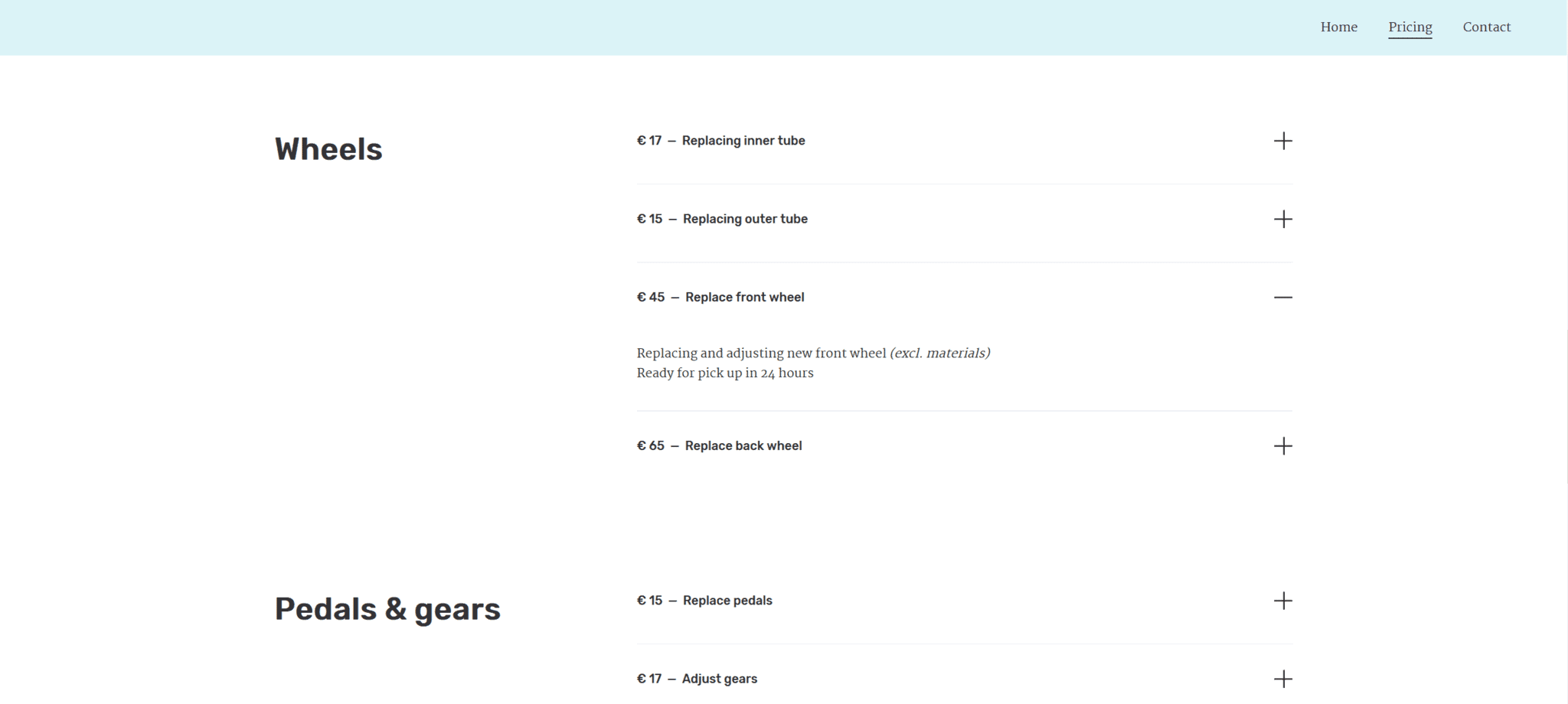
2. Pricing menu
A pricing menu is a structured way to display lots of products. If customers are familiar with certain details, you don’t need to explain them. For example, “Waterproof up to 50 meters” or “Batteries included” don’t require further details.
With Jimdo’s List Block, you can give customers extra information in an expanding panel. They can quickly scan all the products in your pricing menu, then click on products they’re interested in to read more.
If you use a pricing menu, you might not need individual product pages. Or, another option is to keep your product pages and include a pricing menu on each one.

When to use it:
- When you have several products to show.
- When you don’t need to describe each product in detail.
Overview for browsing customers:
- Keep names and descriptions very short.
- Use plenty of empty space around product names so customers aren’t distracted.
Details for choosing customers:
- Use names customers are familiar with.
- Use lists instead of full descriptions.
Offers for buying customers:
- Keep price info clear and simple.
- Keep related products close together for comparison.
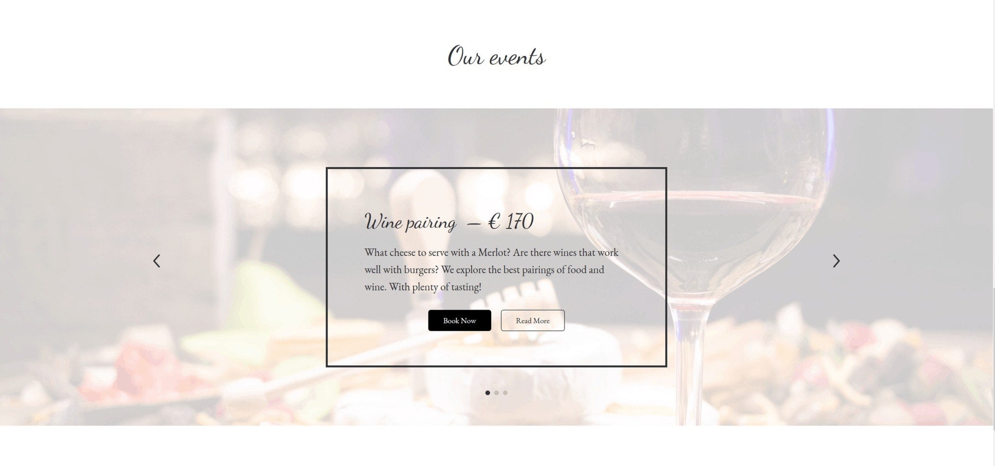
3. Pricing slider
Having the lights on your car repaired is a necessity. Treating yourself and your friends to wine tasting is a luxury (well, most of the time!). You know that feeling you get when you snap up a luxury product when it’s on offer? That triumph plays a big role in your decision to buy. Customers don’t just buy a product or service, they buy the feeling that purchase promises them.
By using a pricing slider, you can combine factual information with images that evoke emotion. Images appear one at a time, so it takes a bit longer to see all products on offer. But every product gets a chance to make an emotional impact.
A pricing slider can also be a great addition to other types of pricing pages. You can use it to highlight certain products and bring them to your visitors’ attention.

When to use it:
- When the decision to buy is more emotional than rational.
- When you have images that make an emotional impact.
Overview for browsing customers:
- Use very short titles.
- Use images that show how your product makes buyers feel.
Details for choosing customers:
- Highlight one or two details in the image.
- Include links to detailed product pages.
Offers for buying customers:
- Show the price in each image tile.
- Include a call-to-action button in your slider like “Buy Now” or “Add to Cart.”
How to optimize your pricing page
Your pricing page helps customers decide to buy from you. They can make a confident choice because your descriptions and images tell them everything they need to know. What else can you do to influence their buying decision?
Highlight products to encourage buyers
You’ve probably seen companies use this technique before. They make one product stand-out on their pricing page. Customers pay more attention to it and are more likely to buy it.
You can highlight a product by:
- Adding a text like “Popular!” or “Bestseller!” beside it in your pricing table or menu.
- Showing the product earlier in your slider or by using a different image-style.
Special offers
Once they hit the buying phase, your customers are looking for the best deal. You can boost your “deal appeal” by adding more value or by lowering the price.
- Adding value: “Free fruit smoothie with every summer yoga session!”
- Lowering the price: “5% discount on every summer yoga session!”
This works especially well if there’s a chance customers will miss a deal if they don’t buy in time. This feeling of urgency encourages people to order because they’ll get a better deal now than if they wait ‘til next week. Introducing an availability or time limit is a good way to win a customer before your competitors.
- Availability limit: “First 15 buyers get a free fruit smoothie after every session!”
- Time limit: “Book today and get a 5% discount on your summer yoga block!”
Pricing page checklist
The best pricing pages combine:
- A structured overview, important details, and clear offers. This helps visitors browse, choose or buy.
- A design that fits the number of products, the level of detail customers want, and the way your customers decide to buy. This can be a pricing menu, table, or slider.
- An irresistible deal. You can make your deal more appealing by highlighting a product or including a special offer.
A good pricing page can make a big difference to your website and your business. It’s full of useful information and it shows visitors that you understand what matters to your customers. Clear pricing will also help you attract the right kind of customers and filter out people who aren’t your target market or shopping in your price bracket. Saving everyone time!
If you haven’t added pricing page to your site yet, this is the perfect chance to create one. Follow these pricing page best practices and let us know how you get on!


