You need to captivate your website visitors the moment they come to your site. For that reason, it’s important to know how to create compelling landing pages that are optimized for lead capture or sales.
Landing pages are, quite simply, the pages that you encourage people to “land on” when they come to your website. You can either direct people to a landing page with a paid marketing campaign (e.g. AdWords, email marketing, or Facebook ads) or optimize the page for search. To optimize a landing page for search engines, you’ll need to find the keywords you want to target, so check out our post on how to do keyword research with Google’s Keyword Planner if you haven’t already.
Landing pages serve a dual purpose: They drive search traffic to your page (by showing up high in search results) and they generate leads or sales (by encouraging visitors to give an email address or purchase a product). It’s important to note that the homepage of your site is often your best-ranking landing page so the tips below will apply to optimizing your homepage as well.
In this article, I’ll show you two strong examples of landing pages. The examples have taken different approaches, which demonstrates that there is more than one way to capture leads or increase sales with landing pages.
Of course, there are many other ways to go about creating landing pages. If you’ve seen a great example, let us know in the comments or on Twitter.
1. Show off your product
Landing pages are like salespeople that live on your website. The best salespeople are friendly, direct, and thorough. Most importantly, a good salesperson—and a good landing page—understands and addresses the customer’s needs.
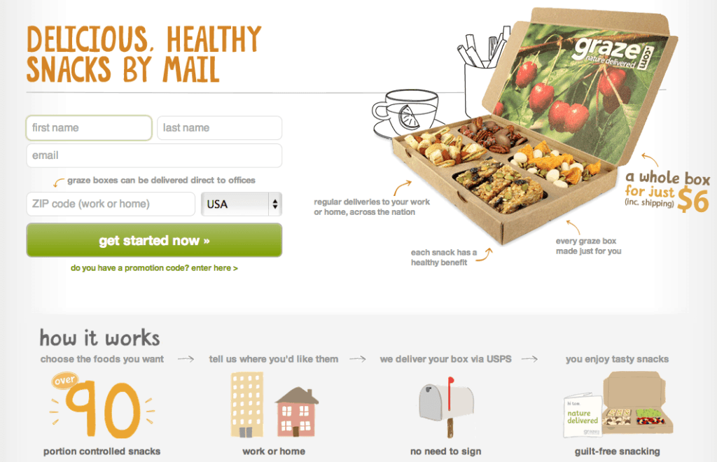
Graze, a startup that delivers delicious, healthy snacks, has an extremely effective landing page with a strong call to action and a concise message.

As you design your own landing page, keep the following lessons from Graze in mind.
Easy sign-up:
Landing pages should include a clear call-to-action—that’s what you want people to do when they get to the page. In many cases, you’ll want people to submit a form, as in the example above. Taking a cue from Graze, you’ll want to keep a few things in mind when creating a form.
- Keep it brief: There’s no need to ask for information you don’t need. Cut out any field that’s not 100% necessary—in one case, a company that removed a field for phone numbers saw a 5% increase in conversion rate.
- Seriously, cut out fields: In most cases, all you need is a name and an email address. Sometimes an email address is enough. The fewer fields you have, the higher your conversion rate will be.
- Test your buttons: Designing the perfect button is a science and an art. Make a good-looking button, but test the color, shape, and text to improve your conversion
Simple product overview:
Anyone who visits Graze’s homepage knows immediately what they offer. Using a large, annotated picture, they show exactly what a snack box contains. In addition, they show how the delivery process works.
In short, Graze anticipates questions that potential customers will likely have—Can you deliver to an office? How many choices are there? Are these snacks healthy?—and answers them with concise copy and interesting graphics.
As you refine your landing pages, consider what unanswered questions your customers may have, and make sure that you address them.
Clear pricing:
Before anyone is going to submit a form on your site, they want to know what it’s going to cost them. Graze prominently displays the price of a snack box on the homepage of their website. They also offer one extra piece of information: the price includes shipping.
If you read my post a couple weeks ago, you know that free shipping can increase your sales, so advertising it prominently on your landing pages is a great strategy.
Bring your business online with Jimdo.
2. Talk about a problem your customers have
Another way to create a successful landing page is to talk about a general problem that your business can solve. If you own a bicycle shop, for instance, you could create a landing page explaining how to repair a flat tire and offer your own products when you talk about the tools and parts that are required.
One company that follows this strategy perfectly is Bellroy, which sells high-quality leather wallets.
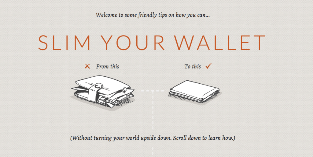
Bellroy has a landing page called “Slim Your Wallet,” which shows you how to solve the common problem of a bloated wallet. This landing page shows up extremely high in organic search for “making your wallet smaller,” “slimming your wallet,” and “reducing the size of your wallet.” In other words, anyone who is looking for help with slimming down their wallet is probably going to find this page.
At the bottom of the page, Bellroy sells their own wallets as a solution to this common problem, meaning that tons of targeted customers (people who want slimmer wallets) are seeing Bellroy’s products.

Common problem
We all know someone who has a wallet so fat they can’t sit down without pulling it out of their pocket. Bellroy promises to show anyone who is looking for a slimmer wallet that it isn’t as hard as it looks.
It’s important to note that Bellroy is framing this landing page as a problem with a solution—in other words, they are greeting potential customers at the moment they notice a problem in their lives and saying, “We can help you with that.” Try to think about your own business and the problem it solves when creating a landing page.
Great images
The minimalist design of Bellroy’s landing page makes the excellent images even more noticeable. Great graphics depicting gigantic, overstuffed wallets highlight the problem in the clearest way possible.
Consider the best way to show off your product, and, if necessary, hire a designer through a service like 99Designs to achieve the professional look you need to inspire confidence in your potential customers.
Doesn’t look like a sales pitch
Ultimately, the goal of Bellroy’s landing page is to convince people to buy their wallets. That said, when I first came across this page, I was unfamiliar with Bellroy’s products and was simply impressed by the advice they were providing.
As you scroll through the landing page, you don’t feel pressured to purchase anything. By the time you get to a list of wallets available for purchase, you’ve already seen how inefficient traditional wallets are, and you may be motivated to try out something new. But if you don’t, Bellroy never uses any pushy sales language—their focus is entirely on solving your problem.
When you construct your landing page, remember that the customer is searching for something. Your goal should be to offer a solution subtly, rather than overtly pushing your product.
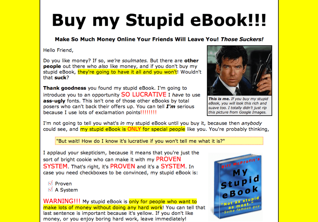
Here’s an intentionally exaggerated example of what you shouldn’t do when building a landing page:

If you follow the tips above, your landing page shouldn’t look like this one.
More resources
Building a great landing page takes a lot of research, effort, and revision. One of the best things to do is look at existing pages that are successful. My favorite resource for landing page inspiration is Unbounce’s list of 35 Beautiful Landing Page Examples.
It’s more and more common to have a striking video as the centerpiece of homepages and landing pages—one of the best services for creating beautiful product videos is Animoto. You can also use Biteable to make quick and easy animated explainer product videos. Give them a look if you haven’t already.
Best luck with your landing pages. After you’ve tried building yours on your own website, send us a link in the comments so we can check it out!

